Friday, June 09, 2006
Another suggestion

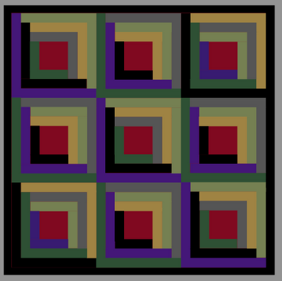
Good thought, knitnut, but unless I integrate another color (I think seven is enough!), the black log will bump up against the border and look strange. I also tried making the border red but it still looks unbalanced with the black logs. So far, I'm liking the black center/border best. Thanks for all the opinions!